7.3 Simple Linear Regression
Let’s build up the model further. For example, we could attempt to explain some of the between-person variance in the Grade 2 verbal score from the Grade 1 verbal scores. But, before we do, let’s examine the distribution of the between-person differences in the Grade 1 verbal scores.
ggplot(wiscsub, aes(x=verb1)) +
geom_histogram(binwidth=2.5, fill="white", color="black", boundary=0) +
xlab("Verbal Ability Grade 1") +
ylab("Count") +
xlim(0,50) +
theme_classic()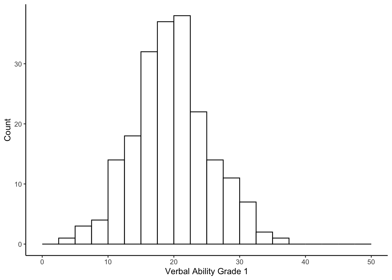 And the relation between the Grade 2 and Grade 1 verbal ability scores.
ggplot(wiscsub, aes(x=verb1, y = verb2)) +
  geom_point() +
  stat_ellipse(color="blue", alpha=.7) +
  xlab("Verbal Ability Grade 1") +
  ylab("Verbal Ability Grade 2") +
  ylim(0,45) +
  xlim(0,45) +
  theme_classic()
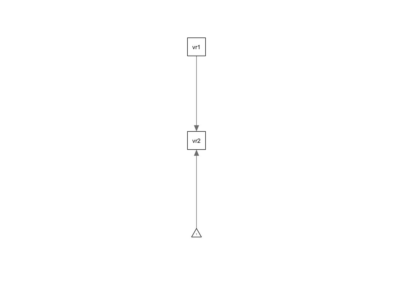
7.3.1 Regression Equation and Model Fitting
Our regression model becomes \[ verb_{2i} = b_01_i + b_1verb_{1i} + \epsilon_{i}\]
##
## Call:
## lm(formula = verb2 ~ 1 + verb1, data = wiscsub, na.action = na.exclude)
##
## Residuals:
##      Min       1Q   Median       3Q      Max
## -11.5305  -3.0362   0.2526   2.7147  12.5020
##
## Coefficients:
##             Estimate Std. Error t value Pr(>|t|)
## (Intercept) 10.62965    1.05164   10.11   <2e-16 ***
## verb1        0.75495    0.05149   14.66   <2e-16 ***
## ---
## Signif. codes:  0 '***' 0.001 '**' 0.01 '*' 0.05 '.' 0.1 ' ' 1
##
## Residual standard error: 4.261 on 202 degrees of freedom
## Multiple R-squared:  0.5156, Adjusted R-squared:  0.5132
## F-statistic:   215 on 1 and 202 DF,  p-value: < 2.2e-16
7.3.2 Path Diagram
We might also be interested in a graphical depiction of our model. This can be accomplished with the semPaths package.
7.3.3 Interpreting Model Parameters
How do we interpret the parameters here?
The intercept, \(b_0\), is the expected value for the outcome variable when all of the predictor variables equal zero. So, we would expect a child to have a Grade 2 verbal score of 10.62965 if they have a Grade 1 verbal score of 0.
The slope, \(b_1\) is the expected difference in the outcome variable for each 1-unit difference in the predictor variable. So, across children, for each 1-point difference in a child’s Grade 1 verbal score, we would expect a 0.75 point difference in the Grade 2 verbal score.
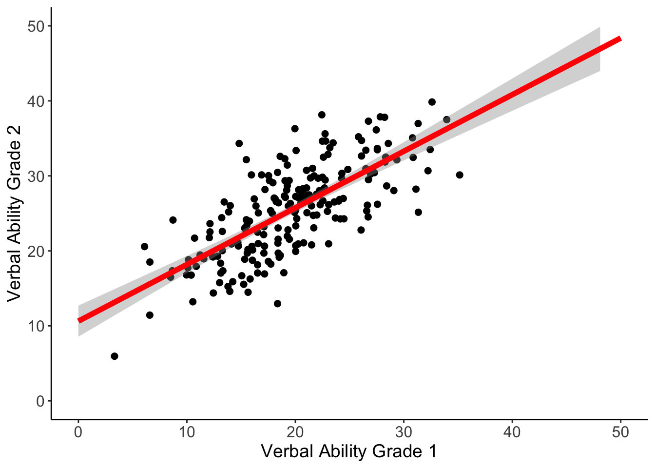
7.3.4 Plotting Regression Line
We can plot the relation between ‘verb1’ and ‘verb2’, and include the predicted line from the analysis.
ggplot(data=wiscsub, aes(x=verb1,y=verb2)) +
  geom_point(size = 2, shape=19) +
  geom_smooth(method=lm,se=TRUE,fullrange=TRUE,colour="red", size=2) +
  labs(x= "Verbal Ability Grade 1", y= "Verbal Ability Grade 2") +
  xlim(0,50) +
  ylim(0,50) +
  theme_bw() +
  theme(
    plot.background = element_blank(),
    panel.grid.major = element_blank(),
    panel.grid.minor = element_blank(),
    panel.border = element_blank()
  ) +
  #draws x and y axis line
  theme(axis.line = element_line(color = 'black')) +
  #set size of axis labels and titles
  theme(axis.text = element_text(size=12),
        axis.title = element_text(size=14))
## Warning: Using `size` aesthetic for lines was deprecated in ggplot2 3.4.0.
## ℹ Please use `linewidth` instead.
## This warning is displayed once every 8 hours.
## Call `lifecycle::last_lifecycle_warnings()` to see where this warning was
## generated.## `geom_smooth()` using formula = 'y ~ x'